Friday 4th November
Media Language and Representation
What is this?
Album Cover
What is the genre?
Pop/Rock
Who are the target audience?
14-25
How is the artist represented?
The artist is represented as loud and brave by the facial expressions also the images included. The denotations we can see here is that there are roses, stars, birds, and a grunge font with a large size. The connotations we can assume here is that it's a emo like album considering the imagery and we can assume its an album because of the artist name in the top left corner.
What told you these things?
Media language: How the media through their forms, codes, conventions an techniques communicate meanings.
Sound, Camera-work, Editing, mise en scene.
Denotation : elements that arent arguable
Connotations : Elements that are arguable
Denotative elements between the products:
The denotative elements in the first image that says 'royalty', you can see a tattooed man holding a child, you can also see jewellery; the watch, necklace and ear-piercing, it is also monochromatic and the people featured are coloured. We can also see the text is thin and contains serifs and a 'parental advisory' sticker in the bottom right corner. The denotative elements in the second image that says 'born this way' we see a girl with everything being monochromatic except her red lipstick, it also shows an old-fashioned bike with large exhausts. We can also see that the text is thick and bold with a shiny gradient of white fading into black.
Connotative elements between the products:
The connotative elements in the first image we can assume its an album cover and we can also assume that he used to be a gang member and now that he has a child he is picking his family over the gang life referring to the title 'royalty'. I see him somewhat as a gang member because
Semiotics
LO: To understand the terminology and theory needed to analyse music videos.
The silence of the lambs camera work
The establishing/full body shot at the start of the scene while it tracks hannibal standing stiff and that he's staring at agent starling creates suspense, also acknowledging his history and the fact he's in a prison cell and the agent is recommended to stand back from him creates a sort of fear and worry.
While hannibal and the agent are talking the camera is purposefully a close up of hannibal but when it changes to the agent it's a mid shot
Analyse
L/O: To practice using the terminology and theory needed to analyse music videos
Music Video - ridla - eastender
The mise-en-scene of the opening shows a rolls royce which can connotate wealth and success shortly a couple seconds later you can see the artist making a gun with his hands which can also connotate to violence, with this information you can assume that the artist used to be involved with gang activity and has escaped that type of behaviour and has become more successful now since he's an artist and can afford to show a rolls royce in a music video.
Friday 16th November
SL - BERLIN
The message of the video is that he's trying to move on with his life and doesn't want to be gang affiliated despite loving all his friends that are gang affiliated.
The genre of the song is rap and we can tell this by the genre conventions such as the fact he's wearing a balaclava to cover his face which could signify to bad activity in the past and doesn't want to be recognised.
The artist is represented as loyal and a caring/generous person, this is seen by the lyrics one example being 'more I make, I'll give back to the kids', this could be to perhaps give back to the community because his past behaviour is most likely not the cleanest. A lyric that shows that he's loyal 'I still got some left for the squad, gave a rack to the killys to play with the opps', this means that he's giving to his old friends that are in the position he used to be in.
Wednesday 23rd November
List A: Emeli Sande - Heaven (Classic Soul) Released on, 12th August 2011
List B: David Guetta - Titanium (Pop) Released on, November 26th 2011
Emeli Sande - Heaven Lyrics: https://genius.com/Emeli-sande-heaven-lyrics
David Guetta - Titanium Lyrics: https://genius.com/David-guetta-titanium-lyrics
Summary meaning of David Guetta - Titanium:
Is a strong empowering message to the people that are have/are being bullied to refuse to back, referring to the title we must be 'titanium'.
Summary meaning of Emeli Sande - Heaven: Heaven tells that people although if you make bad decisions people are trying to live their life, she resembles being good with her lyrics such as 'I wake with good intentions' and the visuals in the video such as showing churches to resemble religion which can be a connotation to Heaven which is seen as a good place.
Friday 25th November
L/O: To explore the purpose, form and conventions of music videos.
Heaven Includes:
Mid shots + Close ups
Range of angles
Establishing shots/crane/wide angles identifying location
Editing + Cut to the beat
Slow motion used to reflect changes in tempo
Colour grading used to associate with the mood, boring and dull.
Variety of locations
Costume and make up can reinforce colour scheme/tone of video
Can be seen as a angel/priest
Props can illustrate lyrics/create realism
Performance, singing
Wednesday 30th November
L/O: To explore the conventions, contexts and representations in Heaven
Feminine
Revealing clothes/Possibly seductive since her jacket is hanging down
Facial expression
Makeup, stereotypical red lipstick
Typical feminine colour scheme: pink with a tiny bit of blue
She's the main focus, very plain background
Heaven
Where was it filmed? Bethnal Green
Who directed it? Jake Nava
How was it released? via digital download and vinyl
Can you find any quotes or press releases from either the artist or the record label about the video and what it is supposed to be about? 'We wanted to capture a real British vibe and keep it really simple to emphasize the lyrics'
In Heaven Sande is represented as a sort of religious figure,
Friday 2nd December 2022
In Heaven street life is represented by temptations, such as drugs or sexual activities, we can also tell it's about street life because of the MES, it's purposefully shot in London, Bethnal Green so it makes a connection with the audience by showing streets, tunnels and corner shops as well as in the background we see a variety public figures and vehicles because the visuals are trying to make it a typical town and realistic to the viewer. It is also filmed with a hand-held, old camera to give it a rough feel, Emeli Sande is a professional singer so you would think she has enough money to buy expensive equipment, however, I feel like she has done this on purpose to gain a better relationship with her viewers, also signifying that she's one of us as well and not just some famous singer. Emeli is represented as a religious figure, a saviour almost, one reason being her attire is fully black with metallic necklaces showing seriousness it can suggest thats she's dressed like a nun which is a religious figure. In the song it says 'I wake with good intentions' and the song name itself 'Heaven' suggests Christianity, the lyrics could mean that she tries to many good deeds throughout the day to go to Heaven, one of the first shots we see is a lady in a red dress going down a dark alley in a red dress which is most likely a club, the descending movement could imply Hell and the colour of the dress can also imply sex, this is resuming the theme of temptations throughout Heaven.
Throughout the video we can see people giving into temptations this is shown visually by drug abuse as we see a scene of a lighter being passed to another person and a man smoking, the use of drugs can be seen as a way to escape this highlights
Friday 7th December 2022
LO: To explore the use of media language and intertextuality in case study videos.
Where was it filmed and who directed it? Sainte-Marthe-sur-le-Lac and at Dorval-Jean XXIII High School, in the province of Quebec, Canada, David Willson
What is the message/meaning of the video? Is a strong empowering message to the people that have/are being bullied to refuse to back down, referring to the title we must be 'titanium'.
What was going on in 2010/11 worldwide? London Riots
How the camerawork reflects the child's view of the world - The camerawork shows that the child scared this
How the MES shows the setting to be early 80s American suburbia - When the child enters her house we can tell by the television a very small old-fashioned box television.
How authority is shown - The authority is displayed as violent this is clearly seen at the end of the video when the child is running from the authority possibly because she is scared of them because of their actions, when they catch up to the child they then point multiple guns at the child on the floor.
Friday 9th December 2022
Intertextuality in Titanium
Super 8 - Same actor in Titanium and also a supernatural element,
E.T - Links to E.T because the boy on the bike at the start going home which was exactly what was happening in Titanium, also the supernatural element.
Superargo - Idea of single person being against an army/group,
Common spielberg tropes -
Titanium has many intertextuality references in it, for example the common Spielberg tropes, he is known for doing camera zooms on a characters face to enhance their expression, we can see this in Titanium when we zoom on to the kid's face, this is normally used to make us feel what they are feeling. Another common Spielberg trope is middle-class values, as the child is speeding down the road on his bike we can see that it's a suburban area, when Spielberg does this in the movies he directs he normally ends it on a happy American lifestyle ending but in Titanium it does quite the opposite as we see in the end the child overcoming everything and a burst of light blasts out of him. This leads into another common trope as Spielberg used bright lights to create an unknown/mystery element when other people normally use darkness to present the unknown.
Wednesday 14th December
Wednesday 4th January 2023
In Heaven the ideologies created are; hedonism, feminism; individualism. Temptation/pleasure is shown throughout this music video at the start we can see a lady walking down a dark staircase which is most likely some club and the colour could suggest sexual activity which refers to hedonism, there are also other examples such as the people smoking/drug dealing, this can also suggest that they urging a sense of relaxation which can be pleasure to them. Feminism is also portrayed in this music video by Emeli Sande's, her attire is quite plain and black which could imply mystery and power, her attire is also very similar to a priest which is normally a male role, this demonstrated gender equality. Also individualism is shown throughout the music video since almost all the shots are focused on her showing that she is the main focus, at the start of the music video we can also see her by herself looking out a window which can imply that she's self-reliant. Listening to the lyrics 'i wake with good intentions' can imply that she's trying to be a good person and that's why she's self-reliant because she feels like its her duty to help other people.
In Titanium the ideologies created are; patriarchy; individualism.
Wednesday 11th January 2023
Advertising
LO: To understand the purpose of advertising and the language used to analyse texts
Use of red and black creates a unsettling atmosphere.
The attire, the model has lots of bead necklaces around her which gives a genie-like creepy look, this is most likely to reflect the name of the perfume which is 'hypnotic poison'.
The stare is intense to create intimidation which references to the name of the product.
The text is golden with thin letters which could suggest it holds a lot of value.
The attire seems like a skimpy black dress that exposes her upper body a lot which could create a desire which makes it hypnotic like the product suggests.
How do they advertise -
AIDA
Advertisers traditionally used this approach to hook audience's attention in advertising:
Attention
Interest
Desire
Action
In the lynx advert implies that once you wear lynx you will instantly be more attractive and gain more attention, the clicker showcased in the video displays the number 1930 which resembles that amount of women he thinks that have checked him out showing that it boosts your confidence by a lot. We can also see he's an average looking guy, needs a haircut and we can see he has basic attire on, nothing special, however he's smiling because of the so called attention he's gained from the smell of lynx, aka 'the lynx effect' as displayed in the bottom right corner. Also if you pay attention to the background there is a gradient of white fading into a light blue making the model the main focus because the colours aren't potent they are subtle you can also associate this colour with hygiene.
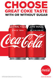
In the coca-cola advert we can see a cutout of elvis presley which is known as an iconic singer and a statement which says 'they don't make 'em like they used to, we do' which is referring to coca-cola still tasting good as it did when it started which was 1886, which can also suggest they are just iconic as elvis presley. We can also see it says 'original taste' coca-cola's slogan, this reinforces this claim even more. Another technique used is in the 'we do' of the text we can see it's bolder than the rest of the text which creates hierarchy and importance.
Friday 13th January 2023
Representations:
LO: To explore how representations are constructed in advertising.
Wednesday 18th January 2023
Preferred or Dominant reading: the reading the company wants to get across to the consumer (agreeing), leading to purchase of product.
Negotiated Reading: accept the meaning but might not want to buy the product
Oppositional Reading: reject the message and will not buy the product
Exam Set Texts
Old Spice -
Overview - Old spice is an American brand that contains of male grooming/hygiene products, made in 1937.
Brand image and values (before and after) -
Previous advertising campaigns - smell like a man, man, never let a friend lose his swagger, smell ready for anything.
Star vehicle: Representations and values (not shelter) -
Advertising campaign content -
Social context (UK) - shelter 2011 -
Lucozade Sport -
Overview - Lucozade is a British brand and is known an as 'isotonic' sport drink providing electrolytes making people hydrated and maintain performance.
Brand image and values (before and after) -
Previous advertising campaigns - find your flow, in a different league, made to move.
Star vehicle: Representations and values (not shelter) -
Advertising campaign content -
Social context (UK) - shelter 2011 -
Shelter -
Overview -
Brand image and values (before and after) -
Previous advertising campaigns -
Star vehicle: Representations and values (not shelter) -
Advertising campaign content -
Social context (UK) - shelter 2011 -
Friday 20th January 2022
In the old old spice advert we can see it has more of a serious tone to it by the use of darker colours and a wavy font with a bold font on the description of the product. I feel like it's targeted to a older audience the old advert as the recognition of the brand is a old-fashioned ship, which doesn't seem intriguing to the younger audience, it also mentions the word 'men' which can confirm it's for an older audience. There also seems to be vintage decoration in the background of the product such as a gold box and a painting with a gold frame which suggests wealth, this could imply the scent is a rich, ocean-like and manly.
In the new old spice advert the colours are more vibrant, giving it more of a varied audience, the font is thin, doesn't have as much hierachy as the old advert, and it says that the product is a 'bahamas scent comes from an anti-perspirant mine in the bahamas'. Then goes onto say 'this fact has not been fact-checked' adding some comedy which could further more prove that it's targeted to more of a varied audience this time instead of just older people, as you could assume a older 'man' would want a serious scent.
Identify:
We can see his body is covered in sand with lots of different things on it such as women in bikinis, palm trees, bits of water and a shark getting fished off by his ear. We can also see there is an erupting volcano on his head with a smoke cloud above it, a mermaid type animal with a spear on his shoulder with a capsized ship, animals such as a monkey and a crab. This could be trying to represent that it's quite an exotic, tropical, vacation type of scent.
Consider:
With what we see visually this can suggest it's a fresh smell, with the perfectly blue ocean and the blue gradient in the sky, people enjoying themselves on the beach, with lots of events taking place on the beach which could imply that the smell is the smell of a capable adventurous boy. We could say that this is targeted to a younger audience group by all the bright colours and the imagery doesn't appeal to older people because for an older man you would think of more serious imagery, the text also 'this fact has not been fact-checked', proves furthermore that its for a younger audience as it's trying to add comedic effect.
Investigate:
The producer has chosen to represent the product like this because as the brand is reforming they have switched their audience, from older people to younger people. They have changed things like the font, in the old one the font was bolder, more intense, whereas in the new advert the font is thinner. We can also talk about the colour change between the old advert and the new advert, the old advert has a grainy dull texture with dark tones, the new advert has strong vibrance and contrast making the colours pop which is suitable for the younger audience transformation they were going for.
Evaluate:
We can see it was very effective as it gained a lot of attention and old spice are one of the most known hygiene products in the US, the change benefitted the company a lot with the celebrity endorsement. They took old spice into a serious brand into a friendly joke-like brand, we can see this by the text 'this fact has not been fact-checked' and also the fact that it's mentioned that the scent is from the bahamas however it features volcanos when there are not volcanos in the bahamas.
Wednesday 25th January 2023
Masculinity
Masculinity in the 70s 80s -
can fight, coordinated, confident, quick-witted, strong, facial hair, moustaches and stubble, long hair, demin, open shirt and medallions, action, violence and general 'toughness'.
I agree that the old spice campaign adheres to modern stereotypes because it's giving the image/thought that a man has to be capable of lots of different things, as well as being strong and muscular. As an example in the old spice advert we can see there are lots of transitions of him doing different manly activities one being the model with his shirt off in a hot tub. Old spice purposely made this hyper masculine advert to reflect on stereotypes and make fun out of them, we also see that the model always his his shirt off showing the standard for a masculine man. I feel like the target audience is younger males, or women of any age that see it as a gift, older men would want something more serious compared to old spice, they take a comical stereotypical response to advertising instead.
Friday 3rd February 2023
Lucozade originally started off as a medical drink it was sold at chemists in a glass bottle this was in the 50's, however in the 70's the general population had grown healthier, so Lucozade sales were less frequent. Lucozade then changed the image of the brand so it was seen as a healthy energy provider to help people from natural daily lulls in energy. In 1982 the slogan then changed to 'aids recovery' to 'replaces lost energy', they used the olympic decathlete daley thompson as brand icon to reflect the image of the product being healthy.
Identify -
We can see in this Lucozade advert Gareth Bale with an intense stare on a blue themed background, we can also see large sans-serif font behind a yellow background. There's also the product that Lucozade is promoting 'Lucozade Sport' near Gareth Bale, the colour of the drink matches with the yellow background used behind the text. In the top right corner it also gives us a very brief description of Gareth Bale at the time, almost like video game statistics, it says his date of birth, height and the team he played for at the time. Says 'scientifically proven' to make it more enticing as well as the condensation on the bottle to portray a refreshing feel, we can also see it's apart of the 'yes' Lucozade campaign.
- Makes the drink look cold
- Colour palette of 2-3
- Bold typography
- Motivational tagline
- Brighter neon colours used in energy drinks
The layout of the Lucozade advert is clear, theres not much to look at which makes the imagery powerful, we can see the clear motivational slogan 'in a different league' in capital letters with a contrasting background to the text so it sticks out, this also matches with the colour palette of blue, orange (the colour of the drink) and white. Another thing about the imagery is that Gareth Bale is the main focus as he's the largest on the image, he is represented as athletic, not only because of his background and signing of Real Madrid at the same but also the slogan and the intense stare with bold shoulders.
Football was the most dominant sport in the UK at the time.
Friday 24th February
Charity Adverts vs Commercial Adverts
Audience: Charity adverts are targeted towards an older audience due to the real life aspect that it involves, the advert also wouldn't be visually appealing to the younger audience due to the colour palette and the amount of words as well as the imagery could be a shock to the younger people, the younger people also wouldn't have money to provide to the charity as they most likely don't have a source of income.
Commercial adverts are targeted towards everyone as an example a toy advert would be extremely appealing to a young audience whereas older people wouldn't care, but it would be the younger audience that persuade the older audience to buy it for them since the younger people wouldn't have money to buy it themselves, unless the younger people save up their money.
Aims + Purpose:
Use of Media Language:
Style and Layout:
Use of persuasive Language:
-Lots of strikes in 2011 about pay
-UK economy was poor
-Cost of living went up
-People pay went down
-Big rise in homelessness
We can see theres face behind the red transparent text, the bold block cap use of typography creates emphasis one including a rhetorical question to further more add to the use of direct address, in the white text below the main focus of the image they use words like 'we' 'your' 'you', they do this to make it feel like it's your responsibility and to make it more personal. They also use high key lighting and de-saturation which is a convention of charity adverts, with a close up so you can properly see the worried expression on the faces as well a strict colour palette this is done to generate a type of guilt to the viewer as well as creating seriousness. The media language used can have an impact on the older audience because of the severity and intense energy, Shelter receives more awareness and acknowledging others about the problem which was the main purpose, however they also receive more donations which shows how affective these adverts where when they achieve more than they had in mind. The representations we can see is that these people chosen to model for this advert are younger people, 20s, well-groomed and by the fact they are well-groomed we could also say they are finically doing well, so seeing these people on the verge of homelessness is a shock to the audience, this also breaks the stereotypical idea of homelessness as you would think of an older person, 50s and scruffy.
Friday 10th March 2023
Analyse how effectively Lucozade uses the combination of elements of media language to create meaning.
Lucozade uses typography to create meaning, we can see the slogan 'IN A DIFFERENT LEAGUE' in block caps to reinforce the statement as if it's shouting the slogan, it is also in a plain non-serif font with black text on a bright yellow background so it's easily understandable, this because Lucozade want to target this product to a younger audience. Another thing we can notice with the typography is that in the bottom left corner there is another use of block caps which is a frequent trend in this advert to create emphasis all over, however it says 'YES' under the Lucozade logo, this is because they want to make it an unconscious decision to say 'YES' when offered the product. Then moving onto the bottle where we can see 'SCIENTIFICALLY PROVEN', again following the block cap trend to create power and meaning, the scientifically proven part acts as evidence for people that are perhaps skeptical about the drink and are wondering if it is really 'IN A DIFFERENT LEAGUE', however this slogan isn't only about the celebrity getting promoted to a better football team but the slogan could also mean the drink is in a different league, superior to all the other drinks. In the top right corner we can see statistics about the celebrity used to promote the drink such as the name, birth, height and the team he currently plays for, Lucozade is treating it as a type of game and performance enhancer due to the celebrity being at his peak in his career, this refers back to the slogan 'IN A DIFFERENT LEAGUE', it's as if this is drink is a cheat to get to the top of performance. On the drink bottle we can see it has 'Sport' in a sleek slanted font to give it that futuristic look to present that this drink is the future of sports enhancement, under the 'Sport' text it also says 'Isotonic performance fuel', isotonic makes it seem like a healthy alternative to all the other drink competitors as well the fuel makes you think of recharging or like refilling a car to get that max performance again.
Lucozade uses celebrity endorsement to create meaning, the time of this advertising campaign
Soft Drinks:
Men grooming products:
Chairty:
THE BIG ISSUE
Friday 17th March 2023
LO: To research institutions and ideologies behind case study product.
Typography: Majority block cap, Sans serif
Mode of address + register:
Shot type + angle: Close up
Colour palette:
Compositions + layout:
Typography:
Mode of address + register:
Shot type + angle:
Colour palette:
Compositions + layout:
Common Conventions:
3 Colours normally makeup the colour palette
Puns
Direct Address
Celebrities
Block caps, Sans serif + Serif
Image semi-blocks the masthead
According to the name and the inclusion of a well-known sportsman, Lucozade sport is intended for athletes (Gareth Bale). Due to the fact that Gareth Bale plays football, it might be more specifically directed at football players as well as the larger sporting community. Given that Lucozade is more frequently consumed by kids and teenagers than by adults, it is reasonable to assume that this group of people falls into the drink's target demographic, which is between the ages of 12 and 16. A play on words in the slogan "In a different league" suggests that the drink is superior to others because it is "in a different league," which could be a reference to football in the advertisement. The advertisement primarily uses blue and yellow, with parts of black and white. The same shades of blue and yellow are used on the product's packaging, making it crystal clear that the item for sale is Lucozade sport. The colour scheme of blue is also present in Gareth Bale's eyes. His eyes' blue hue seems to have been artificially enhanced to better match the advertisement's background. Yes is used as an exclamation point at the bottom of the advertisement. Despite the lack of context, it gives a good impression of the product.
Friday 24th March 2023
LO: To research institutions and ideologies behind case study products.
Who started the the big issue magazine: John bird as a response to the increasing numbers of homeless people in London it worked because it provided an opportunity for people to earn their own income.
What is the magazines ethos and tagline: Changing the world one dose at a time, a hand up not a hand out.
Target audience for the big issue:
Its a social enterprise organisation, its often referred to as a street paper, vendors buy the magazine for 1.50 and sell it to the public for 3, they keep the profits.
Wednesday 29th March 2023
LO: To analyse big issue covers effectively
Similarities:
Central imagery, especially on the KSI front-cover
Similarly like MOJO the big issue magazines displayed have the barcode on the front-cover
Both the examples shown contain a tagline
Differences:
The masthead is located on the top and bottom, usually the masthead isn't spread like that.
The cover lines aren't located on the side of the front-cover
Both of the big issue front-covers displayed do not contain a puff
We can see the masthead is split which anchors the central image, it should be seen that the central image is also enhanced slightly in size covering the masthead to signify the importance, this is beneficial because it makes the viewer read more than they would as well as viewing the image where direct address is used by eye-contact which creates a sort of pressure on the viewer as well as sorrow once the viewer analyses the image more, the seriousness is reinforced by the tagline, which is in block caps to create emphasis, 'i've been invisible since i was 18'.
Wednesday 19th April 2023
Constructing meaning
LO: To analyse the use of intertextuality and multiple meanings.
The cover of the magazine contains a few intertextual references one is a Bansky type graffiti art style, Banksy is known for his political art and is heavily left wing (labour), the graffiti art style can reflect rebellion which could reflect a flaw in the 'hierarchy' considering that the main focus of the magazine is Queen Elizabeth, this is further reinforced by the cover lines and the banner on the magazine that states 'our vendors and their hopes for a chance', 'commonwealth street papers jubilee tour'. This signifies that superior figures are using their wealth for unnecessary things such as the jubilee, which in 2012 cost between 1.2b to 3.6b, big issue is trying to suggest that this money could be used for peoples benefit such as homelessness as implied through 'our vendors and their hopes for a chance'.
Wednesday 26th April 2023
Representation
LO: To analyse the representations and ideologies constructed.
The pink/purple tone around the central image is done to reflect royalty and contextually this is reinforced as many years ago purple was rare and expensive to get.
The central image is represented as serious, firstly the black background behind the central image makes it emotionless and adds a tone of seriousness and this is further proven by the actual image itself where the audience can see former queen Elizabeth and King Charles having a face-off almost with serious facial expressions, the big issue have done this on purpose to suggest a sort of battle, who is better than the other.
This appeals to the target audience in many ways one being the choice of vibrant colours, they attract attention, another way they have caught their target audience attention is by using their preferred artists such as Rita Ora and Fatboy Slim, and one more way they appeal to their audience is by the intriguing taglines like 'being a refugee in the uk allowed my dreams to come true', this applies to many people and they might be wondering how to make their dreams come true as well..
EXAM!!!!!!!
Question 5 Heaven
Beliefs are constructed by shot selection of urban landscape in the music video. This can be contrasted to the performance shots of the artist in home, the artist framed in shots of the skyscape surrounded by nature symbolising a natural and hedonistic star image.
The music video cuts star performance with a narrative of a UK urban environment and city life.
The editing juxtaposes the performance with narrative images of urban life, for example, the female character shot with effects lighting.
There is a reinforcement of heterosexual relationships between characters reinforcing dominant messages about relationships - the white female is shot as though she is emotionally hurt. There are character. At times characters look upset in the music video.
The use of religious iconography signifies something spiritual, for example, the church window or the tattoo on the man's back of angel's wings and images of the crucifix.
Images of children are used to create empathy - they are represented as isolated, vulnerable, with the mother - needing protection.
Is the lead artist singing for redemption or a journey they making - why are they in heaven? There is place for everyone in heaven is connoted through the series of mid to close -up shots cut into the narrative and memories of the star images.
Question 6 (Big Issue)
Target for Big Issue: Make judgement
Target for music video:


SEMIOTICS NOTES: good
ReplyDeleteMUSIC VIDEO INTRO:
Liam - you are NOT completing your classwork despite being given more than adequate class time. This needs to change or your place on the course will be in danger. Please see me if there is a problem.
HEAVEN ANALYSIS:
ReplyDeleteWWW: you clearly understand the themes and ideas behind the song/video
EBI: support your ideas with specific examples from the video (include shot type etc.)
Also - I would suggest that the low-fi style is to represent the social realism genre.
TITANIUM ANALYSIS:
WWW: good intertextuality analysis
EBI: again, your examples should include specific shot types etc.
ADVERT ANALYSIS x2:
WWW: excellent analysis with supported examples
EBI: TERMINOLOGY - the more you practise using it the easier it will become
OLD SPICE ANALYSIS:
WWW: good use of the analysis techniques with good conclusions
EBI: Terminology - MES, typography, imagery, colour palette etc
LUCOZADE ANALYSIS:
This one lacks the detail that the Old Spice analysis does - try using the same process.
LUCOZADE DIRT:
ReplyDeleteGood identification of the media language used but still lacking the analysis - what do these elements, together, connote or represent?
SHELTER ANALYSIS:
WWW: much better use of terminology and analysis of the media language
EBI: be more explicit in making links to the overall meaning/purpose of the advert
EXAM PRACTICE Q:
WWW: your Lucozade analysis is sooo much better. Well done. Great use of terminology and clear explanation of how the combination of elements create different meanings.
EBI: bring in some more details on the celebrity endorsement